Pradeep General Store - Indianama 2018
Indianama is Delhi based agency Animal’s annual effort at aggregating the current state of India’s visual aesthetics. The 2018 edition involved 70 designers rebranding the packaging, stores and fronts of street shops across Delhi. Fruit sellers, general stores, local barbers all got the rebranding treatment usually reserved for high street establishments.
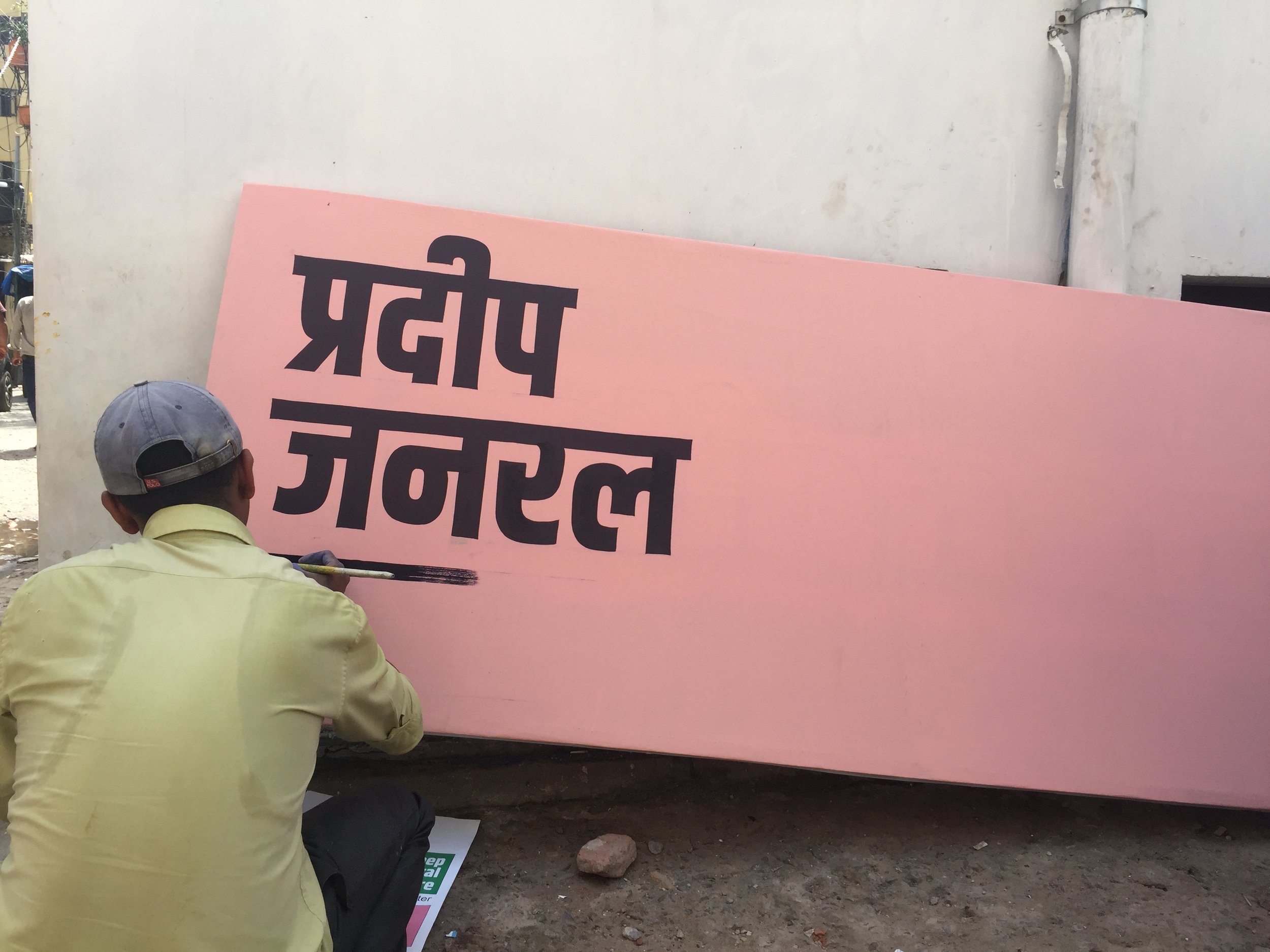
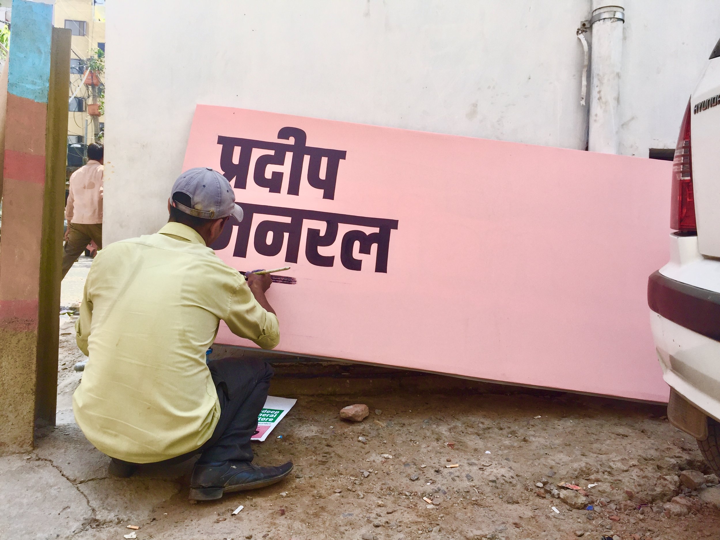
For my Indianama shop I worked on Pradeep General Store - a small kiraane ka dukaan tucked away in a charming corner of Saidulajab, Delhi named Champa Gali.
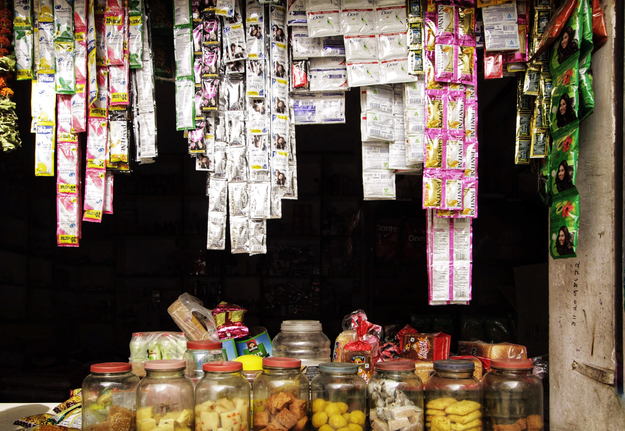

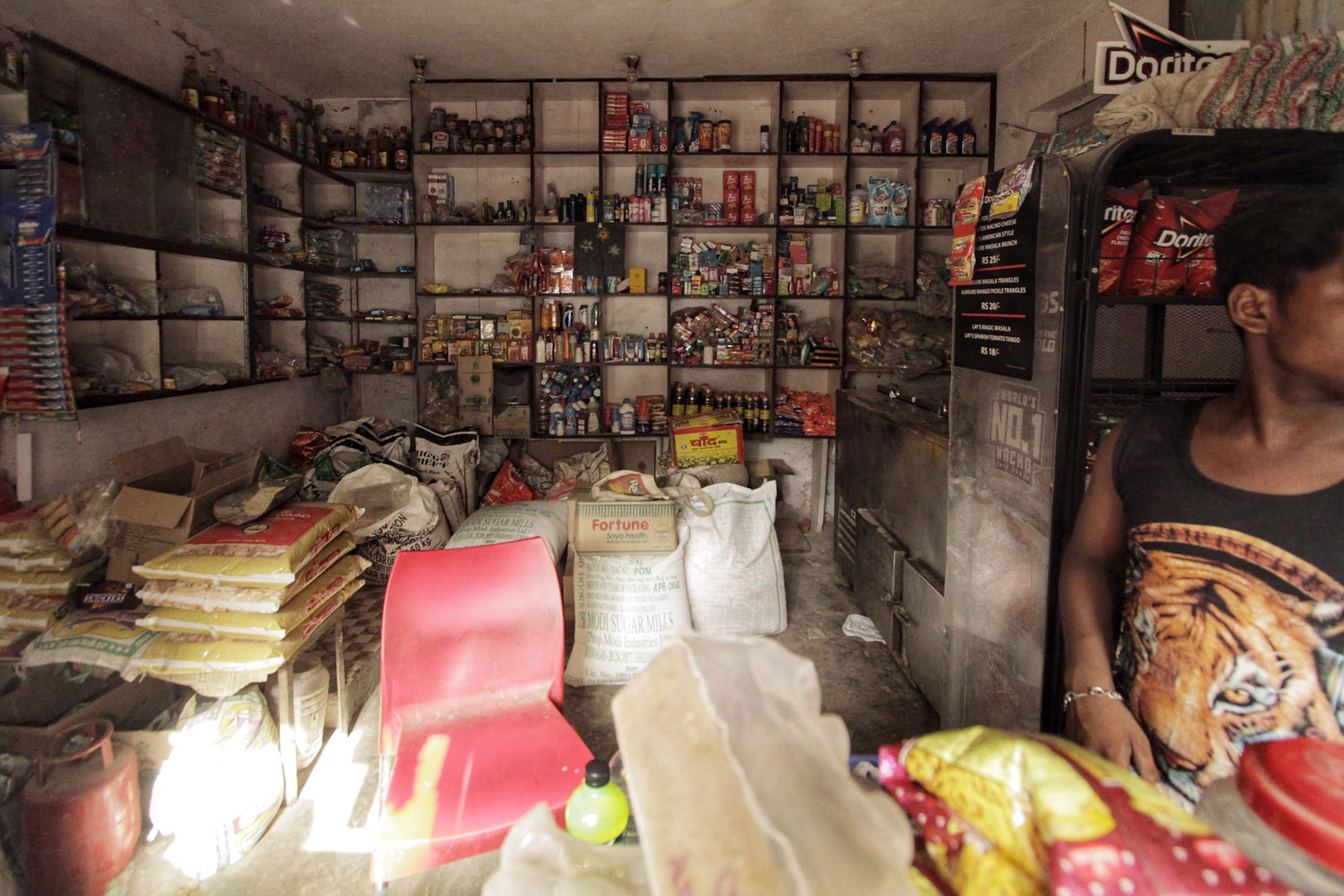
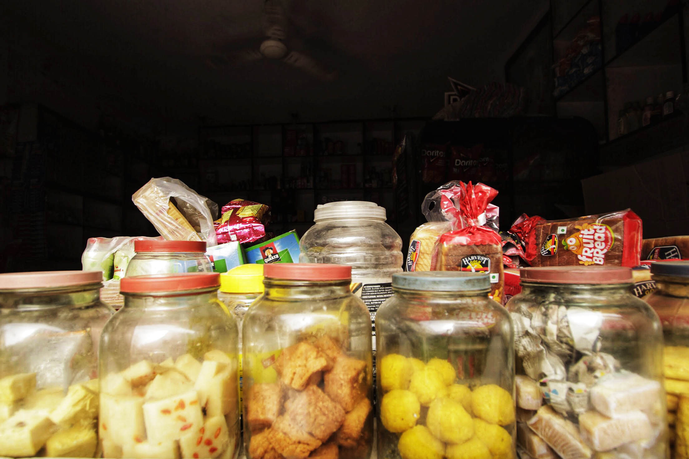
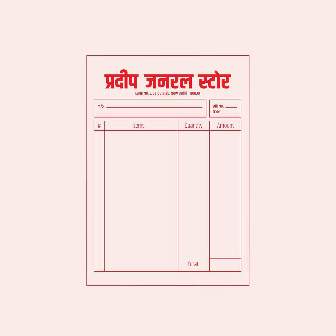
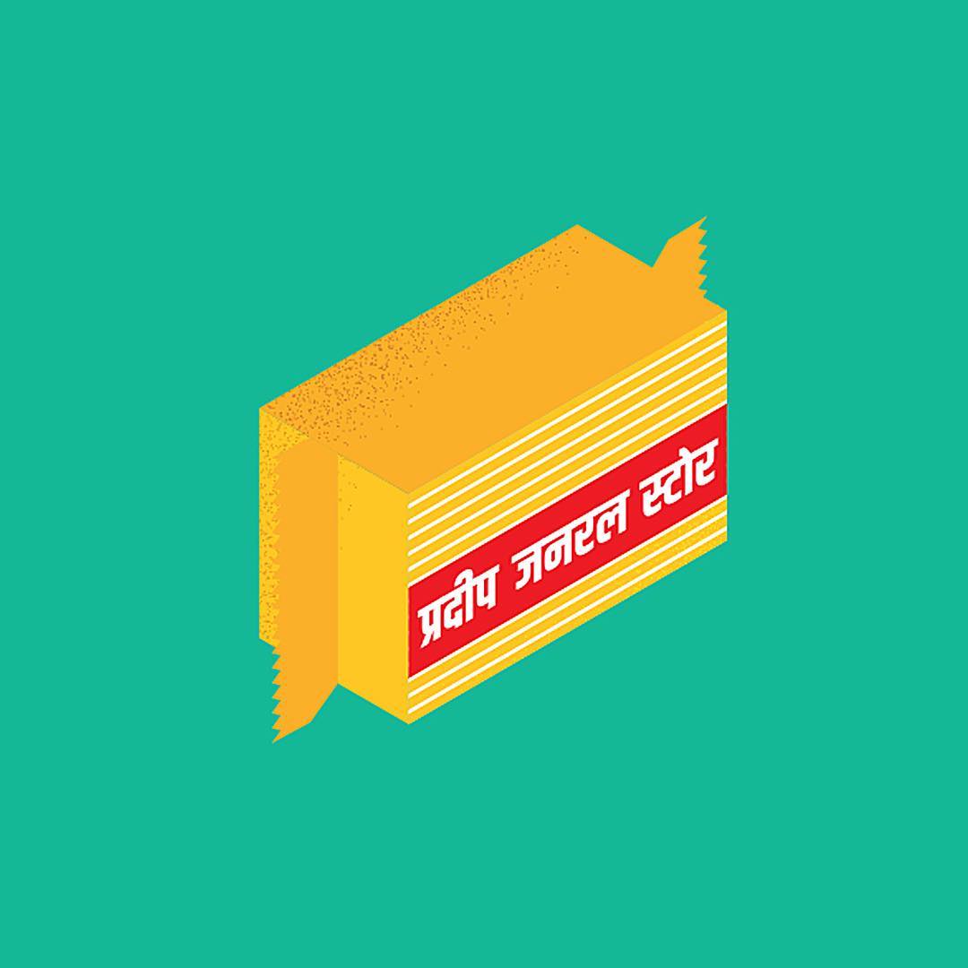
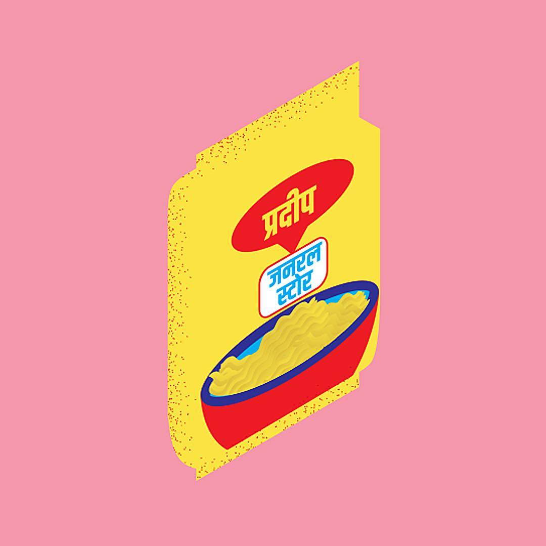
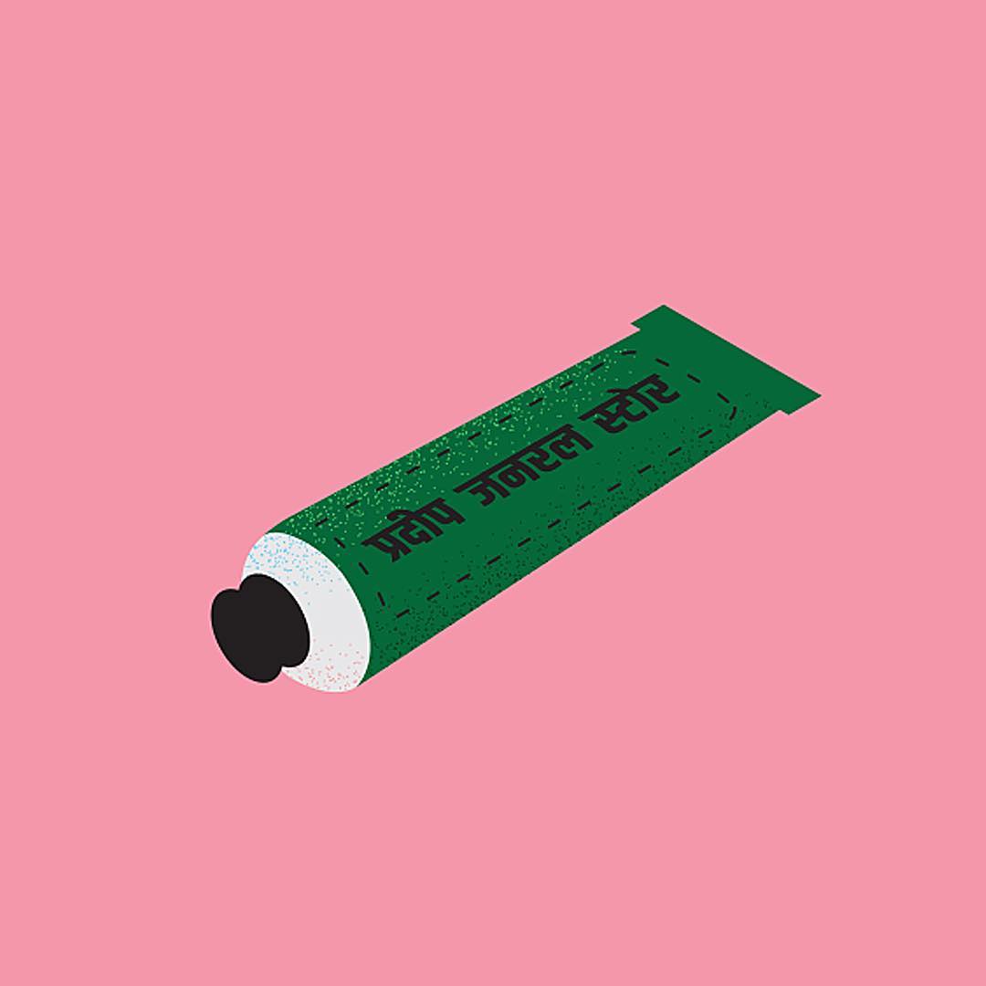
Pradeep General Store is the store found a billion times over on Indian streets.The bare necessities of a household, plus the essentials, and then some. Product offerings span everything from loose grain to detergent.
Visited by - children, parents, grandparents, couples, the single, office goers, the unemployed, students, accountants, artists, salesmen, drivers, business owners, freelancers, vegetarians, non-vegetarians, smokers, non smokers, pot smokers, the rich, the poor, and everything in between. Its hard not to see our general store or kirane ka dukaan as the modern day town square.
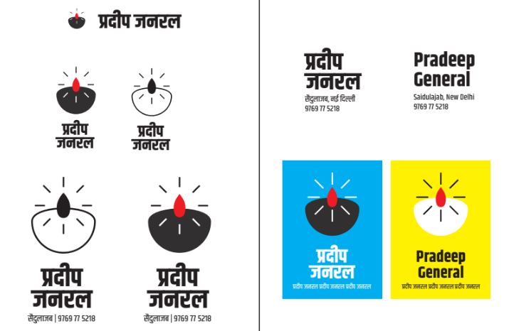
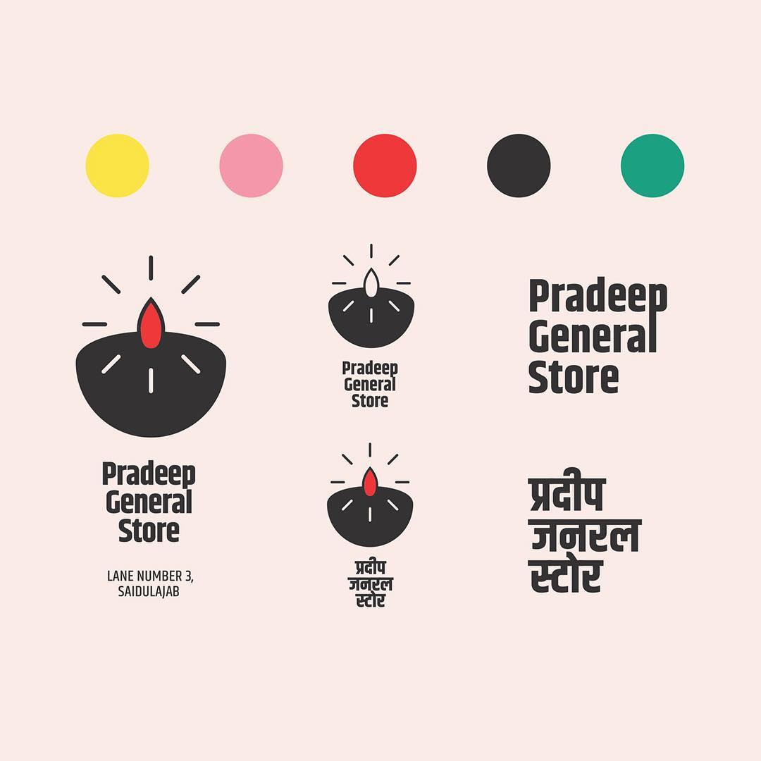
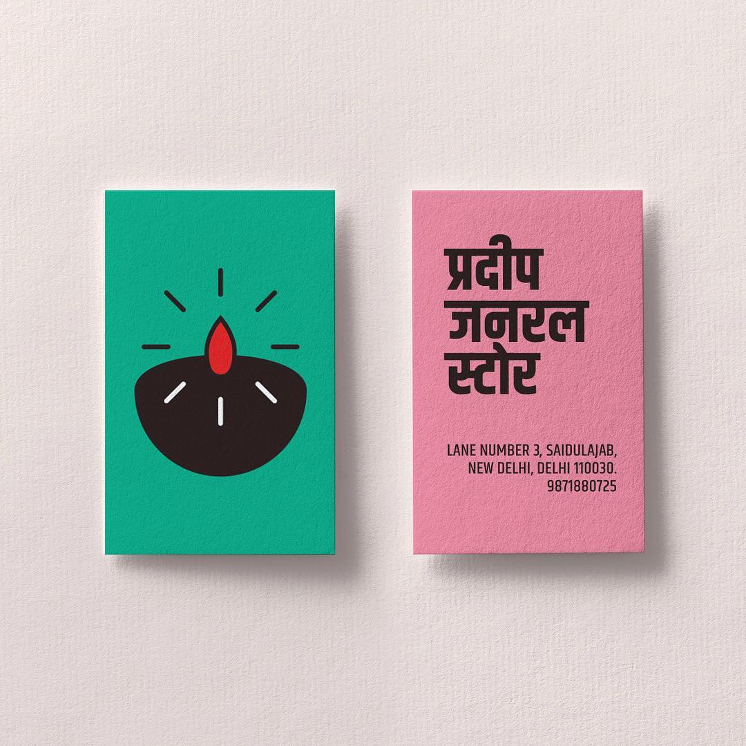
I wanted to create something that captured the universality of a humble shop space that expands to accomodate anyone and everyone’s daily needs. A bilingual type mark was imperative given that Delhi’s two most widely spoken languages are Hindi and English.

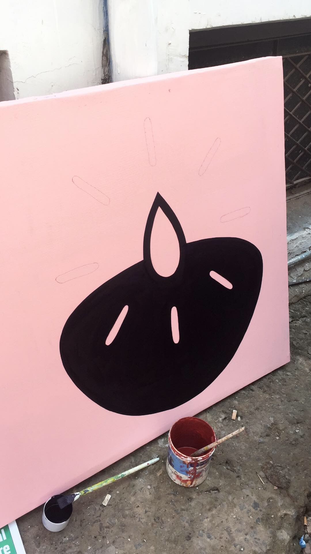
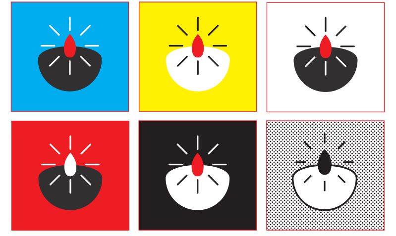
To accompany the type, there had to be a logo. Something simple but not too metaphorical. It was pretty easy to settle on a diya. Aside from them also being called pradeep, diyas stand in for many things in popular consciousness - hospitality, warmth, gatherings, and light. And just like a kiraane ka dukaan its uniquely Indian.

The requirements for a general store were refreshing to cater to after spending a large part of my last year working on animated posters, and web banners of constantly changing different dimensions. Considerations had to be made for packaging that was easy to recreate and sustain after the project was over, for how the store front might attract traffic. At the same time I was extra-worried about selling an outsider’s exotified version of street level India.

Ultimately I decided to do away with a lot of the frills of corporate branding - a guideline for brand colours, typography, digital applications, a scalable logo - since they were digital needs that had little relevance to a general store.
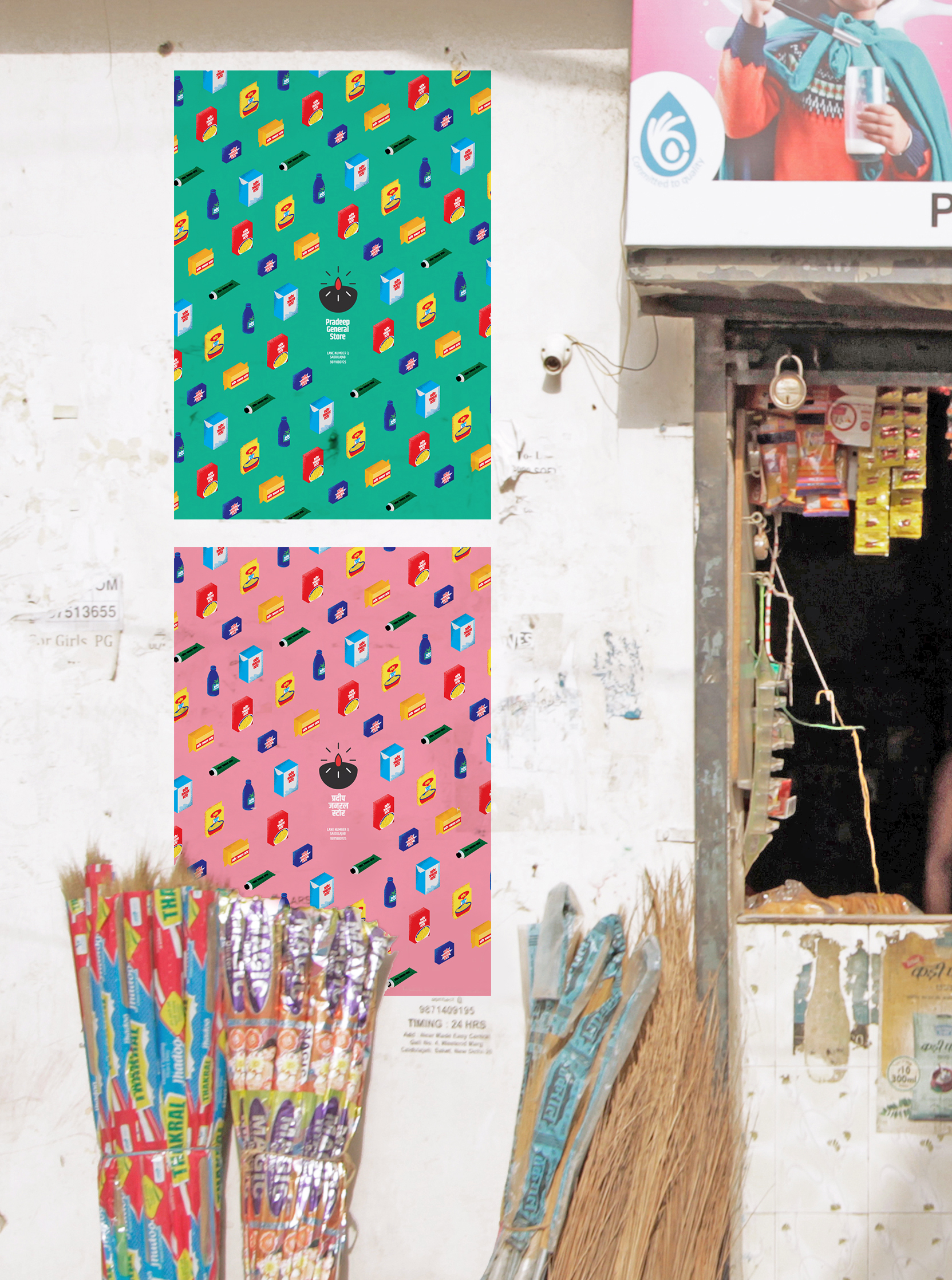
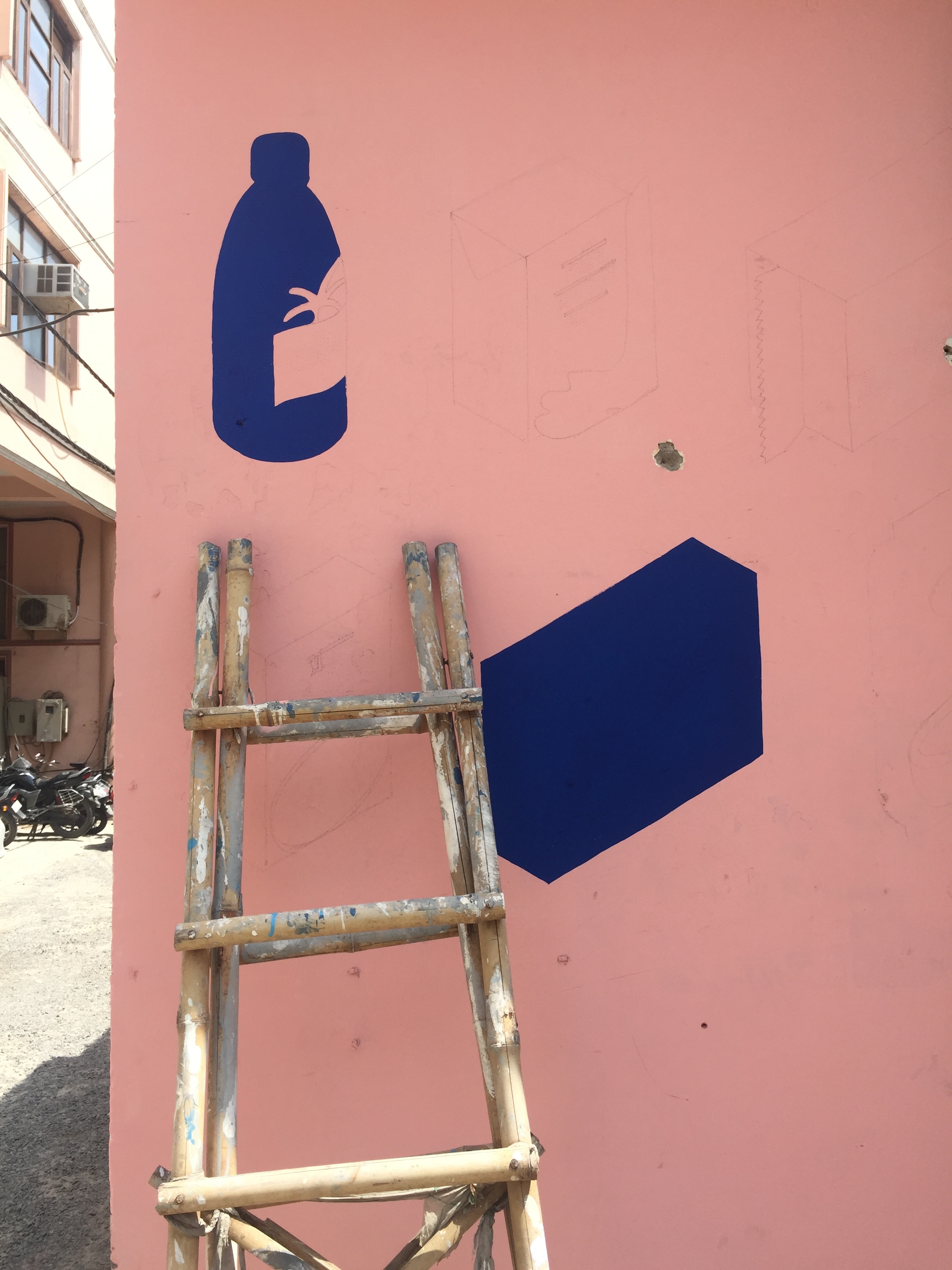
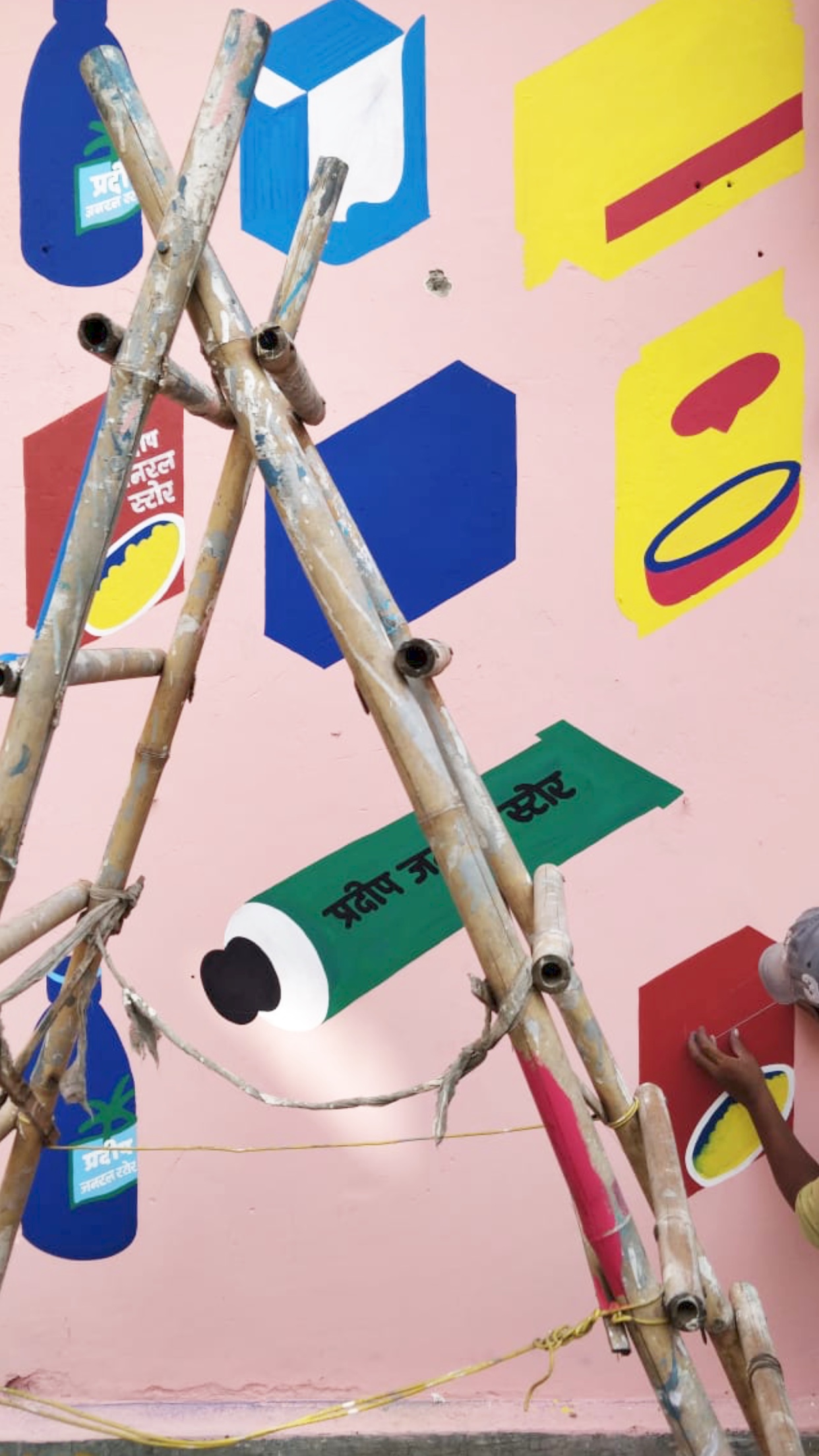
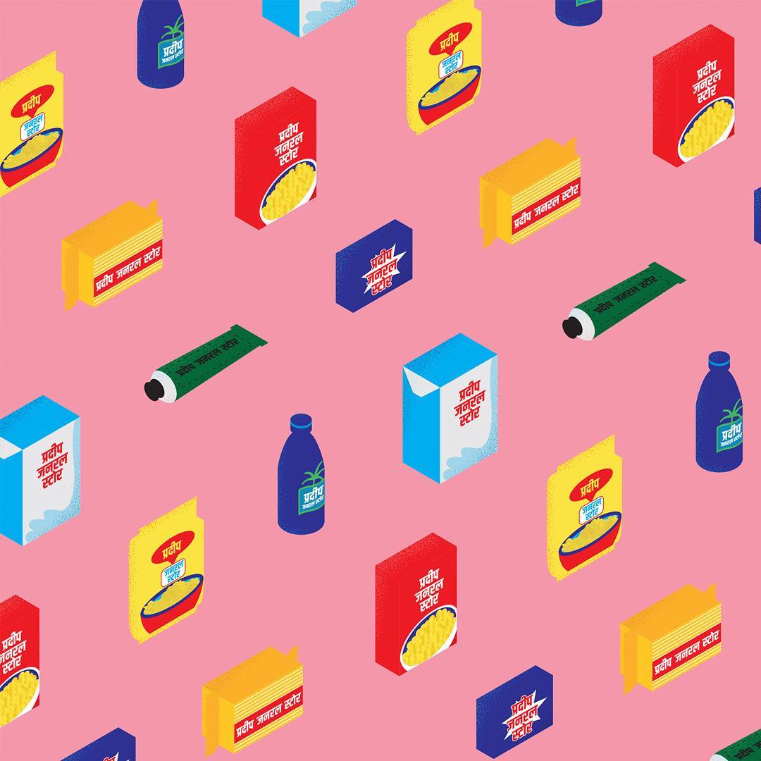
I did however realise that being on the street meant this little could capitalise on its visibility to draw its customers. Drawing from some standard products present in most Indian homes, I created a set of illustrations compiled into a pattern to show Pradeep General Store’s fluid capability of fulfilling every shopper’s needs.


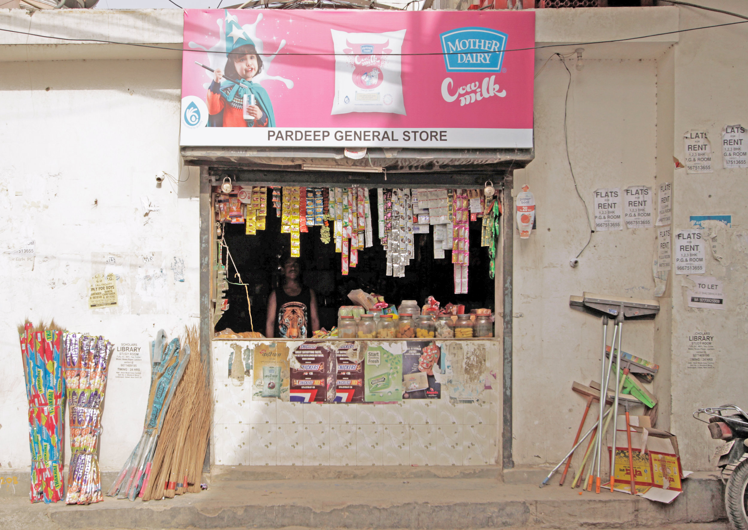
Through August and September of 2018, Indianama worked with an on-ground team in Delhi to execute the different redesigns as well as document them. The result is an incredibly striking storefront that is already a neighbourhood favourite and a backdrop for shoots. With the paint job finished off just in time for Diwali, Pradeep General Store now looks like the special gathering hole it always was.